On Instagram, it’s not just enough that the images look good on their own – they need to work together ‘in the grid’ to create a cohesive look and convey what your brand is all about.
A visitor to your feed will judge it on the basis of the first nine or 12 images – many won’t bother to scroll further down.
So if those images don’t look good together, they may well not follow the feed. For example, if there’s a different filter for every photo or if the colour scheme changes from bolds to pastels to monochrome. There are accounts that get away with this – perhaps because the brand is so famous, or because it’s funny and the feed is less about the look than the captions. But if your account isn’t famous or hilarious, you need to pay attention to the grid.
Here are some examples to show you what I mean.
Jamie Oliver
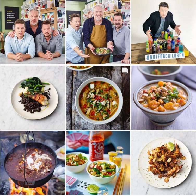
Why it works: The images are grouped in threes, and the colour scheme is consistently earthy with touches of bright colour. Even the circular dishes make it all hang together nicely. There’s a clever mix of images – people, closeups of a dish and some shots showing more detail with a table setting. The backgrounds, bowls, plates, table settings all fit with the Jamie Oliver ethos – nothing is fancy, just substantial, tasty food.
Boden
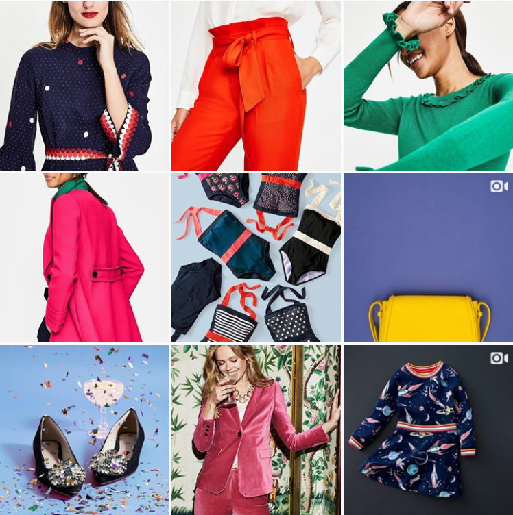 Why it works: Boden is known for bright colour and pattern and naturally, their Instagram feed reflects this. Pops of bold colour mixed with plain, mostly pale backgrounds to help it stand out. Pattern is used in small amounts, but still makes an impact. The repeats of colour and detail make it feel cohesive even if you don’t notice them e.g. the hot pink in two of the photos, the stripe band in the dresses at top left and bottom right.
Me & Orla
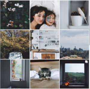 Sara Tasker’s feed occasionally includes promotions but she ensures that these images still align with her core look and values (unlike some influencers!). Could you spot which of these photos is a paid promotion? The filter(s) used are all similar, so there’s a consistent aesthetic even though the subject matter varies. Lots of white balances the dark lighting and liberal use of grey.
How to improve your Instagram grid
A beautiful Instagram feed is all about good design, which is not the easiest thing to grasp. Some people find good design comes naturally- we all know someone who just seems to create the perfect interiors, handmade Christmas cards or even outfits without any effort (or so it seems). I’m not one of those people! But here are some ideas which may help you get a more integrated, cohesive and beautiful feed that people will want to follow!
- Get inspired by others. Next time you look at a fab new feed, just pause and think about why you’d like to follow it. Why does it seem appealing? Could you use some of the ideas in your own feed?
- Limit filters. If you’re not using a filter for photos, it’s the number one thing that can make your feed look better. The Instagram filters are quite overused now. There’s a lot more choice if you use an app like Snapseed or VSCO (both iOS/Android & free). Some of the Instagram planning & scheduling apps like have filters as well (e.g. Preview, Plann).
- Use the rule of three. Whilst all the photos on the grid need to work with each other, start by grouping images in threes. Perhaps three photos which all have a splash of the same colour. Or different views of a featured product – a close-up, one on the shelf and in the shop window perhaps. Images could tell a story of a day out – beginning, middle and end.
- Introduce repeating elements. For some brands, it’s a signature colour – Janet Murray‘s pastel pink as shown. Or circles featuring quotes or employee photos – circles stand out on such a square grid.
- Embrace white space. It doesn’t have to be white, although a white border or background is very effective. If every image is ‘busy’, then the feed will look busy too. Adding a simpler image with lots of empty space (even a blue sky) will break things up.
Hope this advice helps with your feed(s) whatever they are! Leave a comment or reach out to me on Instagram, Twitter or email.
I can help you with Instagram! Check out my Deep Purple Power Hour or Ultraviolet: transform your Instagram package.